#install.packages(c("plotly", "tidyverse", "readxl"))

library(plotly)
library(tidyverse)
library(readxl)Why am I here?
This is the 2nd installment of a small series on snowfall data at Alta, Utah. The geom_smooth() function provides a convenient way to see a trend line, but I can’t say I’ve thought too much about why it does what it does. So, let’s dive into the drift with our snowfall data and ues the geom_smooth() plow to clear our path to understanding.
Learning objectives
For this session, the learning objective is to:
- understand better ggplot’s
geom_smooth()
As always, let’s make sure that our libraries are loaded and if any need to be installed that you run install.packages() line first.
Download the data
This repeats the first step from last post so no need to redo it if you are working in the same project
Monthly snowfall data for the Alta Guard Station is available at the bottom of the this page, (https://utahavalanchecenter.org/alta-monthly-snowfall).
Copy the link to the .xlsx file and follow the script below.
# Download and read the data
data_url <- "https://utahavalanchecenter.org/sites/default/files/attached_files/2025.05.01%20Alta%20Guard%20Snow%3AWater.xlsx"

# Download the file
download.file(data_url, destfile = here::here("posts/snowfall2/alta_data.xlsx"), mode = "wb")

#assign it to an object
df <- readxl::read_xlsx("alta_data.xlsx")

#view the data
glimpse(df)
Rows: 87
Columns: 23
$ ...1 <chr> NA, "Monthly Ave", "Max", "Min", "WINTER YEAR", NA, "19…
$ ...2 <chr> NA, NA, NA, NA, "el nino/ la nina / neutral", NA, NA, N…
$ October <chr> "Snow", NA, NA, NA, "October", "Snow", NA, NA, NA, NA, …
$ November <chr> "H20", NA, NA, NA, "November", "H20", NA, NA, NA, NA, N…
$ December <chr> "Snow", "66.5", "206", "13.5", "December", "Snow", NA, …
$ January <chr> "H20", "6.3", "13.8", "0.9", "January", "H20", NA, "9.3…
$ February <chr> "Snow", "88.3", "244.5", "11.8", "February", "Snow", "5…
$ March <chr> "H20", "8.1", "25.5", "0.8", "March", "H20", NA, "9.68"…
$ April <chr> "Snow", "90.2", "199.7", "1", "April", "Snow", "19.5", …
$ May <chr> "H20", "8.5", "16.899999999999999", "0.1", "May", "H20"…
$ ...11 <chr> "Snow", "81.599999999999994", "156.6", "20.5", NA, "Sno…
$ Season <chr> "H20", "7.4", "13.5", "1.9", "Total", "H20", NA, "3.6",…
$ `Season + may` <chr> "Snow", "86.8", "183", "23.8", NA, "Snow", NA, "69", "6…
$ ...14 <chr> "H20", "7.96", "16.5", "2.4", NA, "H20", NA, "6.85", "5…
$ ...15 <chr> "Snow", "64.400000000000006", "136.30000000000001", "5"…
$ ...16 <chr> "H20", "6.52", "13.5", "0.3", NA, "H20", NA, "6.24", "5…
$ ...17 <chr> "Snow", "32.049999999999997", "34.6", "29.5", NA, NA, N…
$ ...18 <chr> "H20", "3.63", "3.9", "3.4", NA, NA, NA, NA, NA, NA, NA…
$ ...19 <lgl> NA, NA, NA, NA, NA, NA, NA, NA, NA, NA, NA, NA, NA, NA,…
$ ...20 <chr> "Snow", "479.83", "745.5", "273.8", NA, "Snow", NA, "45…
$ ...21 <chr> "H20", "44.7", "71", "23.7", NA, "H20", NA, "43.3", "30…
$ ...22 <dbl> NA, NA, NA, NA, NA, NA, NA, NA, NA, NA, NA, NA, NA, NA,…
$ ...23 <dbl> NA, NA, NA, NA, NA, NA, NA, NA, NA, NA, NA, NA, NA, NA,…The shaping and cleaning steps are all in the previous post as well. We’ll pick up with the df3_snow object.
Plowing through the blizzard
We have a scatterplot (a bunch of snowballs thrown up on the wall) showing the snowfall each month over many years at a ski resort. There’s data everywhere—one month there’s 244.5” another there’s 1”, and an average month has 79” of snow and the whole thing looks a little chaotic. Where’s the trend? The jittering certainly helps, but it’s not that easy to spot the trendline.
Enter ggplot2’s geom_smooth(): the function that gives your scatterplot a “best guess” line, letting your eyes see the the snowflakes for the blizzard (is that the expression???).
plot <- ggplot(df3_snow) +
  geom_jitter(aes(x = month_num,
                 y = amount),
              fill = "blue",
              shape = 21,
              color = "white",
              alpha = .8,
              width = .25,
              size = 4) +
  geom_smooth(aes(x = month_num, y = amount), color = "red") +
  scale_x_continuous(breaks = 1:8,
                     labels = levels(df3_snow$month)) +
  labs(x = "Months",
       y = "Amount of \nSnowfall (in.)",
       title = "Monthly Snowfall at Alta",
       subtitle = "Alta gets a lot of snow, particularly from November through March",
       caption = "Source: Utah Avalanche Center, https://utahavalanchecenter.org/alta-monthly-snowfall") +
  theme_minimal()

plot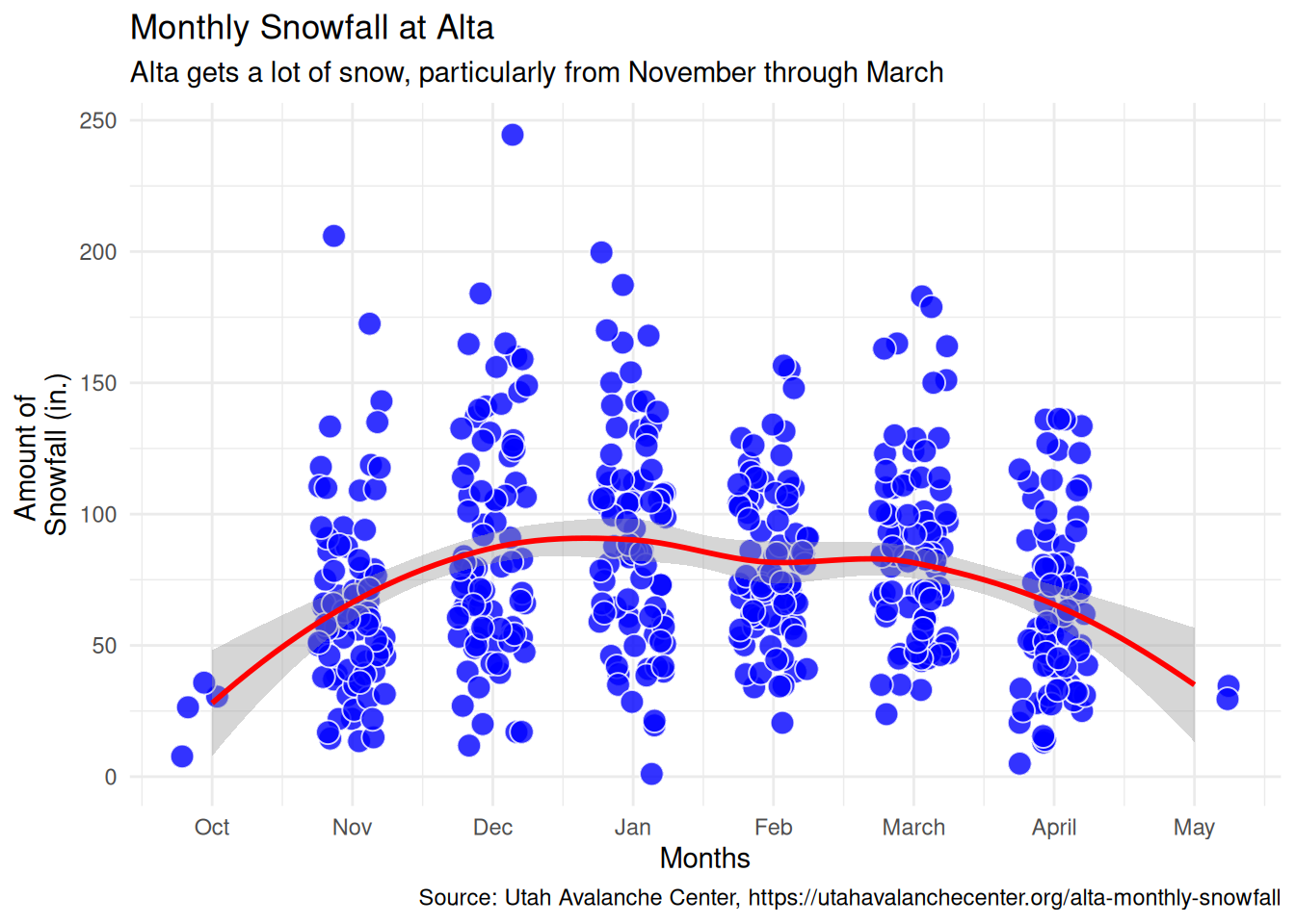
The red line answers the question, “If you averaged all the data points at each month, what’s the smoothed pattern?”
The shaded region around the red line basically tells you how confident we are that the line is where it should be with a wider shaded region meaning less confidence. For the months of October and May there’s less confidence due to the lack of data points compared to the other months.
Behind the scenes, geom_smooth() is using a loess regression as it’s default method. Loess refers to locally estimated scatterplot smoothing. If the relationship in our snow data looked more linear we could use a linear method. To see what this looks like with a linear fit line, all we need to do is add the argument, method = "lm" to geom_smooth(). The chart below shows a linear fit may be appropriate for the overall trend, but it masks any monthly variation which is what I want for planning my ski trip.
ggplot(df3_snow) +
  geom_jitter(aes(x = month_num,
                 y = amount),
              fill = "blue",
              shape = 21,
              color = "white",
              alpha = .8,
              width = .25,
              size = 4) +
  geom_smooth(method = "lm", aes(x = month_num, y = amount), color = "red") +
  scale_x_continuous(breaks = 1:8,
                     labels = levels(df3_snow$month)) +
  labs(x = "Months",
       y = "Amount of \nSnowfall (in.)",
       title = "Monthly Snowfall at Alta",
       subtitle = "Alta gets a lot of snow, particularly from November through March",
       caption = "Source: Utah Avalanche Center, https://utahavalanchecenter.org/alta-monthly-snowfall") +
  theme_minimal()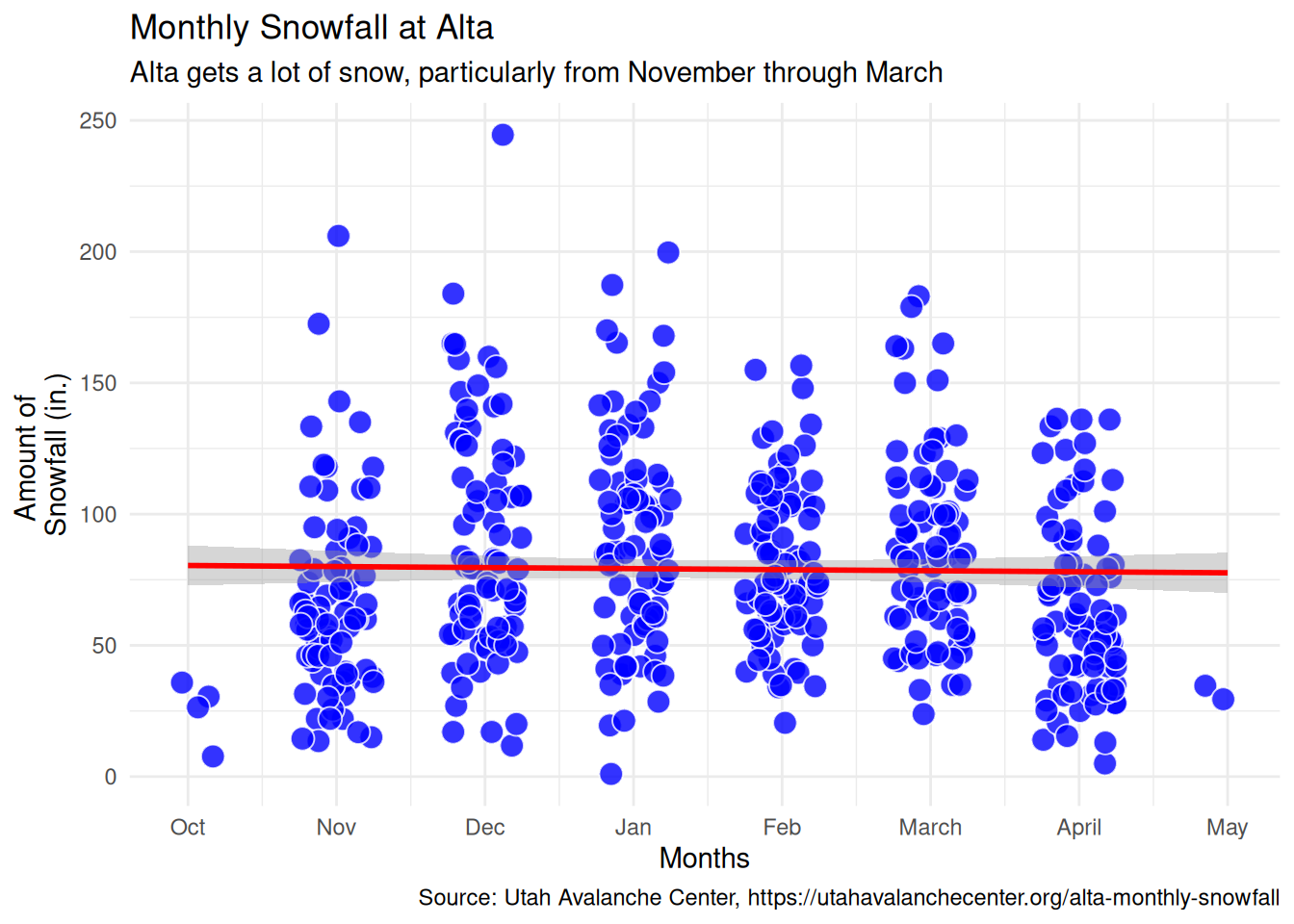
Can I have smoothing lines for different categories?
Great question! geom_smooth() works across categories with little effort. Let’s take a look at what happens if we search for trends in the nino_numeric variable. The nino_numeric variable is the same as the nino variable, but since I used a gradient color scale I converted nino to numbers with the nino_numeric variable.
ggplot(df3_snow) +
  geom_jitter(aes(x = month_num,
                  y = amount,
                  fill = nino_numeric),
              shape = 21,
              color = "white",
              alpha = .2,
              width = .25,
              size = 4)  +
  geom_smooth(aes(x = month_num,
                  y = amount,
                  group = nino_numeric,
                  color = nino_numeric),
              se = FALSE,
              show.legend = FALSE) +
    scale_color_gradient2(low = "#2166ac",    # La Niña blue
                        mid = "#F5F5F5",       # Neutral
                        high = "#b2182b",    # El Niño red
                        midpoint = 0,
                        na.value = "grey50",
                        breaks = c(-3, 0, 4),
                        labels = c("La Niña\nStrong", "Neutral", "\nEl Niño\nVery Strong"))+
  scale_fill_gradient2(low = "#2166ac",    # La Niña blue
                       mid = "#F5F5F5",       # Neutral
                       high = "#b2182b",    # El Niño red
                       midpoint = 0,
                       na.value = "grey50",
                       breaks = c(-3, 0, 4),
                       labels = c("La Niña\nStrong", "Neutral", "\nEl Niño\nVery Strong"),
                       guide = guide_colorbar(ticks = FALSE,
                                              frame.colour = "white",
                                              barwidth = 1,
                                              barheight = 5))+
  scale_x_continuous(breaks = 1:8,
                     labels = levels(df3_snow$month)) +
  labs(x = "Months",
       y = "Amount of \nSnowfall (in.)",
       title = "Monthly Snowfall at Alta",
       subtitle = "Alta gets a lot of snow, particularly from December to January",
       fill = "La Niña ← → El Niño",
       caption = "Source: Utah Avalanche Center, https://utahavalanchecenter.org/alta-monthly-snowfall") +
  theme_minimal()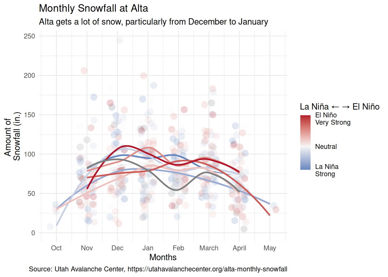
It looks like maybe when there’s el Nino, there might be a slightly higher trend of snowfall. It’s hard to see, and facetting this plot would definitely help.
With ggplot, this is a simple task. Add facet_wrap(), pass the variable you want to facet on, and tell it how many rows and how many columns you want.
facet_plot <- ggplot(df3_snow) +
  geom_jitter(aes(x = month_num,
                  y = amount,
                  fill = nino_numeric),
              shape = 21,
              color = "white",
              alpha = .2,
              width = .25,
              size = 4)  +
  geom_smooth(aes(x = month_num,
                  y = amount,
                  group = nino_numeric,
                  color = nino_numeric),
              se = FALSE,
              show.legend = FALSE) +
  scale_color_gradient2(low = "#2166ac",    # La Niña blue
                        mid = "#F5F5F5",       # Neutral
                        high = "#b2182b",    # El Niño red
                        midpoint = 0,
                        na.value = "grey50",
                        breaks = c(-3, 0, 4),
                        labels = c("La Niña\nStrong", "Neutral", "\nEl Niño\nVery Strong"))+
  scale_fill_gradient2(low = "#2166ac",    # La Niña blue
                       mid = "#F5F5F5",       # Neutral
                       high = "#b2182b",    # El Niño red
                       midpoint = 0,
                       na.value = "grey50",
                       breaks = c(-3, 0, 4),
                       labels = c("La Niña\nStrong", "Neutral", "\nEl Niño\nVery Strong"),
                       guide = guide_colorbar(ticks = FALSE,
                                              frame.colour = "white",
                                              barwidth = 1,
                                              barheight = 5))+
  scale_x_continuous(breaks = 1:8,
                     labels = levels(df3_snow$month)) +
  facet_wrap(df3_snow$nino,
             nrow = 3,
             ncol = 3)+
  labs(x = "Months",
       y = "Amount of \nSnowfall (in.)",
       title = "Monthly Snowfall at Alta",
       subtitle = "Alta gets a lot of snow, particularly from December to January",
       fill = "La Niña ← → El Niño",
       caption = "Source: Utah Avalanche Center, https://utahavalanchecenter.org/alta-monthly-snowfall") +
  theme_minimal()+
  theme(axis.text.x = element_text(angle = 45, hjust = 1))

facet_plot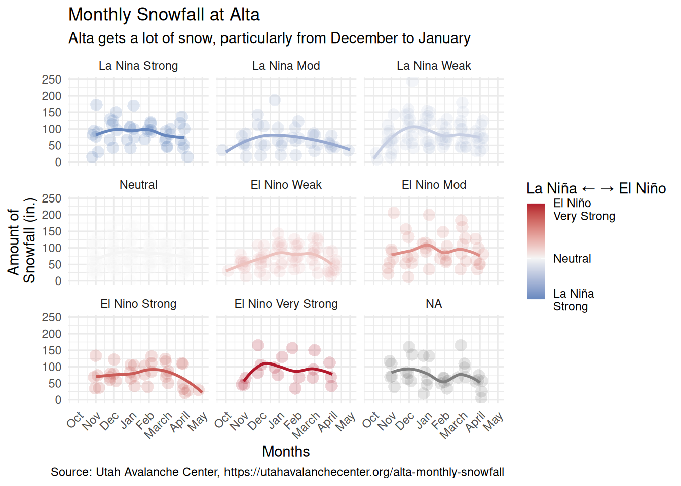
So next time your scatterplot looks like a blizzard, ask geom_smooth() to gently sweep a path through the snow–to highlight the trend(s)–so you can be the first to the lift!