#install.packages(c("plotly", "tidyverse", "readxl"))

library(plotly)
library(tidyverse)
library(readxl)Why am I here?
I was talking with a friend recently about when I should visit Utah for skiing this year. He sent me a link to the Utah Avalanche Center to look at monthly precipitation data for the Alta Guard Station. I’ll use this data to guide my trip planning. For learning purposes, this post will demonstrate how to download, clean, and visualize data using Plotly to create an interactive plot. Enjoy!
Learning objectives
For this session, the learning objective is to:
download a file from a website
shape and clean the data for visualization
visualize the data using Plotly
As always, let’s make sure that our libraries are loaded and if any need to be installed that you run install.packages() line first.
Download the data
Monthly snowfall data for the Alta Guard Station is available at the bottom of the this page, https://utahavalanchecenter.org/alta-monthly-snowfall.
Copy the link to the .xlsx file and follow the script below.
# Download and read the data
data_url <- "https://utahavalanchecenter.org/sites/default/files/attached_files/2025.05.01%20Alta%20Guard%20Snow%3AWater.xlsx"

# Download the file
download.file(data_url, destfile = here::here("posts/snowfall/alta_data.xlsx"), mode = "wb")

#assign it to an object
df <- readxl::read_xlsx("alta_data.xlsx")

#view the data
glimpse(df)
Rows: 87
Columns: 23
$ ...1 <chr> NA, "Monthly Ave", "Max", "Min", "WINTER YEAR", NA, "19…
$ ...2 <chr> NA, NA, NA, NA, "el nino/ la nina / neutral", NA, NA, N…
$ October <chr> "Snow", NA, NA, NA, "October", "Snow", NA, NA, NA, NA, …
$ November <chr> "H20", NA, NA, NA, "November", "H20", NA, NA, NA, NA, N…
$ December <chr> "Snow", "66.5", "206", "13.5", "December", "Snow", NA, …
$ January <chr> "H20", "6.3", "13.8", "0.9", "January", "H20", NA, "9.3…
$ February <chr> "Snow", "88.3", "244.5", "11.8", "February", "Snow", "5…
$ March <chr> "H20", "8.1", "25.5", "0.8", "March", "H20", NA, "9.68"…
$ April <chr> "Snow", "90.2", "199.7", "1", "April", "Snow", "19.5", …
$ May <chr> "H20", "8.5", "16.899999999999999", "0.1", "May", "H20"…
$ ...11 <chr> "Snow", "81.599999999999994", "156.6", "20.5", NA, "Sno…
$ Season <chr> "H20", "7.4", "13.5", "1.9", "Total", "H20", NA, "3.6",…
$ `Season + may` <chr> "Snow", "86.8", "183", "23.8", NA, "Snow", NA, "69", "6…
$ ...14 <chr> "H20", "7.96", "16.5", "2.4", NA, "H20", NA, "6.85", "5…
$ ...15 <chr> "Snow", "64.400000000000006", "136.30000000000001", "5"…
$ ...16 <chr> "H20", "6.52", "13.5", "0.3", NA, "H20", NA, "6.24", "5…
$ ...17 <chr> "Snow", "32.049999999999997", "34.6", "29.5", NA, NA, N…
$ ...18 <chr> "H20", "3.63", "3.9", "3.4", NA, NA, NA, NA, NA, NA, NA…
$ ...19 <lgl> NA, NA, NA, NA, NA, NA, NA, NA, NA, NA, NA, NA, NA, NA,…
$ ...20 <chr> "Snow", "479.83", "745.5", "273.8", NA, "Snow", NA, "45…
$ ...21 <chr> "H20", "44.7", "71", "23.7", NA, "H20", NA, "43.3", "30…
$ ...22 <dbl> NA, NA, NA, NA, NA, NA, NA, NA, NA, NA, NA, NA, NA, NA,…
$ ...23 <dbl> NA, NA, NA, NA, NA, NA, NA, NA, NA, NA, NA, NA, NA, NA,…Shape and clean the data
The data has 87 rows and 23 columns. In looking at the data, it’s clear that the first 6 rows provide a summary of the data rather than the data itself. So, let’s drop those rows.
We’ll use a basic subsetting approach. Within the brackets [], the code before the “,” 7:nrow(df) are for rows, and after the comma come the columns. We want to take everything starting from row 7, and we select all the columns by leaving that part blank.
#assign it a new object name
# so we don't lose data

df1 <- df[7:nrow(df),]
Due in part to the summary data near the top of the file, the columns also need to be renamed, too. Each month has a column for snow and rain. To make for an easier pivot later, we’ll add the prefix “month_” to each rain or snow column.
names(df1) <- c("season",
                "nino",
                "oct_snow",
                "oct_rain",
                "nov_snow",
                "nov_rain",
                "dec_snow",
                "dec_rain",
                "jan_snow",
                "jan_rain",
                "feb_snow",
                "feb_rain",
                "march_snow",
                "march_rain",
                "april_snow",
                "april_rain",
                "may_snow",
                "may_rain",
                "blank",
                "total_snow",
                "total_rain",
                "blank2",
                "blank3")

glimpse(df1)
Rows: 81
Columns: 23
$ season <chr> "1944 to 45", "1945 to 46", "1946 to 47", "1947 to 48", "19…
$ nino <chr> NA, NA, NA, NA, NA, NA, "N", "El Nino Mod", "El Nino Weak",…
$ oct_snow <chr> NA, NA, NA, NA, NA, NA, NA, NA, NA, NA, NA, NA, NA, NA, NA,…
$ oct_rain <chr> NA, NA, NA, NA, NA, NA, NA, NA, NA, NA, NA, NA, NA, NA, NA,…
$ nov_snow <chr> NA, "109", "69", "118", "71", "39", "60", "67", "44", "50",…
$ nov_rain <chr> NA, "9.34", "6.76", "8.57", "6.41", "4.46", "10.08", "6.22"…
$ dec_snow <chr> "57", "83", "63", "80", "160", "137", "66", "156", "65", "1…
$ dec_rain <chr> NA, "9.68", "4.7699999999999996", "4.93", "9.52999999999999…
$ jan_snow <chr> "19.5", "84.5", "61", "46", "132", "133", "112", "115", "11…
$ jan_rain <chr> NA, "7.57", "5.0199999999999996", "4.3899999999999997", "10…
$ feb_snow <chr> "67", "50", "53", "66", "58", "34", "58", "105", "40", "57"…
$ feb_rain <chr> NA, "3.6", "3.9", "4.7", "5", "3.4", "6.8", "9", "4.7", "6.…
$ march_snow <chr> NA, "69", "68", "165", "97", "109", "53", "163", "93", "101…
$ march_rain <chr> NA, "6.85", "5.4", "13.3", "7.17", "10.45", "4.95", "15.43"…
$ april_snow <chr> "57", "55.5", "60", "74", "5", "25", "13", "35", "57", "14"…
$ april_rain <chr> NA, "6.24", "5", "9.15", "0.3", "2.48", "1.35", "4.12", "4.…
$ may_snow <chr> NA, NA, NA, NA, NA, NA, NA, NA, NA, NA, NA, NA, NA, NA, NA,…
$ may_rain <chr> NA, NA, NA, NA, NA, NA, NA, NA, NA, NA, NA, NA, NA, NA, NA,…
$ blank <lgl> NA, NA, NA, NA, NA, NA, NA, NA, NA, NA, NA, NA, NA, NA, NA,…
$ total_snow <chr> NA, "451", "374", "549", "523", "477", "362", "641", "411",…
$ total_rain <chr> NA, "43.3", "30.8", "45.1", "38.700000000000003", "46", "42…
$ blank2 <dbl> NA, NA, NA, NA, NA, NA, NA, NA, NA, NA, NA, NA, NA, NA, NA,…
$ blank3 <dbl> NA, NA, NA, NA, NA, NA, NA, NA, NA, NA, NA, NA, NA, NA, NA,…Now it is beginning to take shape. There are two extra columns on the end where someone did some calculations, and a blank column before the total columns. Notice, we named those with the word “blank”. Let’s drop those and drop the columns that total the rain and snow fall.
#remove last two columns that have some
# undefined numbers
#also remove the total snow and rain columns
df2 <- df1 |>
  select(-20:-23, -blank)
Now we have a wide dataset that we want to make longer. For visualizing with ggplot, we want all the snow or rain data in a single column and the months in a single column. This is easily done with tidyr’s pivot_longer() function.
For the pivotting, we select columns 3 thru 18 with the cols argument.
We will move the names of the columns to a column called “month” and a column called “type”. Because we know that each name is separated by a _ we can separate the columns into these two new columns using the _ as a separator. The month prefix will go to the “month” column and the “rain” or “snow” suffix will go to the “type” column.
The values will be placed in a new column called “amount”. Now, run the code.
df3 <- df2 |>
  pivot_longer(cols = 3:18,
               names_to = c("month", "type"),
               names_sep = "_",
               values_to = "amount")


glimpse(df3)
Rows: 1,296
Columns: 5
$ season <chr> "1944 to 45", "1944 to 45", "1944 to 45", "1944 to 45", "1944 t…
$ nino <chr> NA, NA, NA, NA, NA, NA, NA, NA, NA, NA, NA, NA, NA, NA, NA, NA,…
$ month <chr> "oct", "oct", "nov", "nov", "dec", "dec", "jan", "jan", "feb", …
$ type <chr> "snow", "rain", "snow", "rain", "snow", "rain", "snow", "rain",…
$ amount <chr> NA, NA, NA, NA, "57", NA, "19.5", NA, "67", NA, NA, NA, "57", N…The new dataframe, df3 is much longer, indeed. We now have 1296 rows and 5 columns. These 5 columns each contain a single data type that we can easily use for analysis after we clean up a few more things.
Change the “N” in the nino column to “Neutral” and make the months start with uppercase letters in the month column.
#recode the N response in nino column
df3$nino <- df3$nino |>
  recode("N" = "Neutral")

#recode the months
df3$month <- df3$month |>
  recode("oct" = "Oct",
         "nov" = "Nov",
         "dec" = "Dec",
         "jan" = "Jan",
         "feb" = "Feb",
         "march" = "March",
         "april" = "April",
         "may" = "May")
Finally, we want to remove the rain data, make sure the type column is numeric, remove rows of missing data, and ensure that our factor data has an order. Factor data is categorical data. We want it to be clear to R that these are not just words but categories.
To do this last part, we will use factor() on the month and nino columns and then define the levels or order that we want to be recognized for the months and for the strength of el nino or la nina.
#now we can look at just the snowfall
df3_snow <- df3 |>
  filter(type == "snow") |> #remove rows with rain
  mutate(amount = as.numeric(amount)) |> #convert amount to numeric
  filter(!is.na(amount)) |> #remove missing amounts
  #Set factor levels for months
  mutate(month = factor(month,
                        levels = c("Oct", "Nov", "Dec", "Jan", "Feb",
                                   "March", "April", "May")),
         month_num = as.numeric(month),
         #Set factor levels for nino
         nino = factor(nino,
                       levels = c("La Nina Strong",
                                  "La Nina Mod",
                                  "La Nina Weak",
                                  "Neutral",
                                  "El Nino Weak",
                                  "El Nino Mod",
                                  "El Nino Strong",
                                  "El Nino Very Strong"))) |>
  #provide a numeric value for nino as well in a new column
  mutate(nino_numeric = case_when(
    nino == "La Nina Strong" ~ -3,
    nino == "La Nina Mod" ~ -2,
    nino == "La Nina Weak" ~ -1,
    nino == "Neutral" ~ 0,
    nino == "El Nino Weak" ~ 1,
    nino == "El Nino Mod" ~ 2,
    nino == "El Nino Strong" ~ 3,
    nino == "El Nino Very Strong" ~ 4,
    TRUE ~ NA_real_
  ))

glimpse(df3_snow)
Rows: 489
Columns: 7
$ season <chr> "1944 to 45", "1944 to 45", "1944 to 45", "1944 to 45", "…
$ nino <fct> NA, NA, NA, NA, NA, NA, NA, NA, NA, NA, NA, NA, NA, NA, N…
$ month <fct> Dec, Jan, Feb, April, Nov, Dec, Jan, Feb, March, April, N…
$ type <chr> "snow", "snow", "snow", "snow", "snow", "snow", "snow", "…
$ amount <dbl> 57.0, 19.5, 67.0, 57.0, 109.0, 83.0, 84.5, 50.0, 69.0, 55…
$ month_num <dbl> 3, 4, 5, 7, 2, 3, 4, 5, 6, 7, 2, 3, 4, 5, 6, 7, 2, 3, 4, …
$ nino_numeric <dbl> NA, NA, NA, NA, NA, NA, NA, NA, NA, NA, NA, NA, NA, NA, N…Look at the data types in the nino, month, and amount columns. We also added a numeric column for nino. This is useful when visualizing for smoothing lines or using continuous color scales.
Visualize the data
Let’s take a look at what we’ve got.
ggplot(df3_snow) +
  geom_point(aes(x = month,
                 y = amount)) +
  theme_minimal()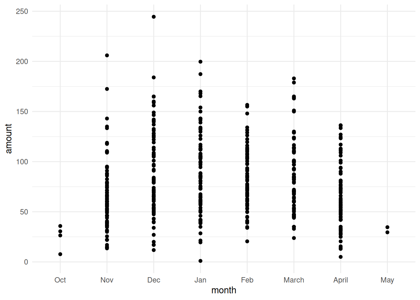
We’ve got the usual months for snowfall,and we’ve got lots of points. It’s a little hard to see where they all land, but we can start to make out that from November through March Alta generally has good snowfall. Let’s add some jitter to see the points more clearly, improve labels, and give it some color.
Then, let’s add a smoothing line using geom_smooth(). This line will help us more easily identify the middle of a noisy dataset.
TipUnderstanding
geom_smooth()
The geom_smooth() function in ggplot2 adds a smoothed conditional mean line to your plot, helping visualize trends in noisy data. By default, it uses LOESS smoothing for datasets with fewer than 1,000 observations and generalized additive models (GAM) for larger datasets.
Common parameters include: - method - specify the smoothing method (e.g., “lm” for linear, “loess”, “gam”) - se - whether to display confidence interval (default is TRUE) - span - controls LOESS smoothness (0-1, where smaller = wigglier) - formula - for custom model formulas like y ~ poly(x, 2) for polynomial fits
Example: geom_smooth(method = "lm", se = TRUE) adds a linear regression line with 95% confidence bands.
plot <- ggplot(df3_snow) +
  geom_jitter(aes(x = month_num,
                 y = amount),
              fill = "blue",
              shape = 21,
              color = "white",
              alpha = .8,
              width = .25,
              size = 4) +
  geom_smooth(aes(x = month_num, y = amount), color = "red", se = FALSE) +
  scale_x_continuous(breaks = 1:8,
                     labels = levels(df3_snow$month)) +
  labs(x = "Months",
       y = "Amount of \nSnowfall (in.)",
       title = "Monthly Snowfall at Alta",
       subtitle = "Alta gets a lot of snow, particularly from November through March",
       caption = "Source: Utah Avalanche Center, https://utahavalanchecenter.org/alta-monthly-snowfall") +
  theme_minimal()

plot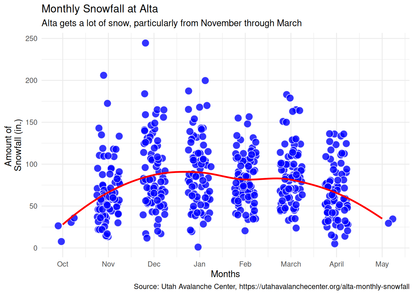
Using Plotly from R is pretty easy with an existing ggplot object. We’ve already defined our ggplot object as plot above. We can simply pass this to plotly and we get an interactive data visualization. Pretty cool!
ggplotly(plot)The tooltip that pops up is not that useful out of the box. So, let’s provide an additional parameter to geom_jitter() called text, and then tell plotly to use that for the tooltip.
The new text parameter will pull data from the season, month, amount, and nino columns and combine it using paste0().
The main glitch with plotly is that it doesn’t handle the subtitle and caption from ggplot. I’m not sure why, but I added that in separately. Another option is to just add these as text directly in the .qmd file that generates the final output.
plot <- ggplot(df3_snow) +
  geom_jitter(aes(x = month_num,
                 y = amount,
                 text = paste0("Season: ", season,
                                "\nMonth: ", month,
                                "\nSnowfall: ", round(amount, 1), " in.",
                                "\nENSO: ", nino)),
              fill = "blue",
              shape = 21,
              color = "white",
              alpha = .8,
              width = .25,
              size = 4) +
  geom_smooth(aes(x = month_num, y = amount), color = "red", se = FALSE) +
  scale_x_continuous(breaks = 1:8,
                     labels = levels(df3_snow$month)) +
  labs(x = "Months",
       y = "Amount of \nSnowfall (in.)",
       title = "Monthly Snowfall at Alta",
       subtitle = "Alta gets a lot of snow, particularly from November through March",
       caption = "Source: Utah Avalanche Center, https://utahavalanchecenter.org/alta-monthly-snowfall") +
  theme_minimal()

plot_ly <- ggplotly(plot, tooltip = "text")

plot_ly_cap <- plot_ly |>
  layout(annotations = list(
    #subtitle
    list(x = 0,
        y = 1.08,
        text = "Alta gets a lot of snow, particularly from November through March",
        xref = "paper",
        yref = "paper",
        xanchor = "left",
        showarrow = FALSE,
        font = list(size = 12, color = "gray30")
      ),
    #caption
    list(
        x = 1,
        y = -0.25,
        text = "Source: Utah Avalanche Center, https://utahavalanchecenter.org/alta-monthly-snowfall",
        xref = "paper",
        yref = "paper",
        xanchor = "right",
        showarrow = FALSE,
        font = list(size = 9, color = "gray50")
      )
    ),
    margin = list(t = 80, b = 100)
  )

plot_ly_cap
Conclusion
Now we have a basic interactive graphic that leverages plotly. If you can ggplot, then you can ggplotly.
Part 2 of this series delves further into smoothing lines, and part 3 will make predictions for future monthly snowfall.