#install.packages(c("tidyverse", "ggimage", "magick", "gganimate", "showtext", "nflfastR", "nflreadr"))

library(nflfastR)
library(nflreadr)
library(tidyverse)
library(gganimate)
library(ggimage)
library(magick)
library(showtext)Why am I here?
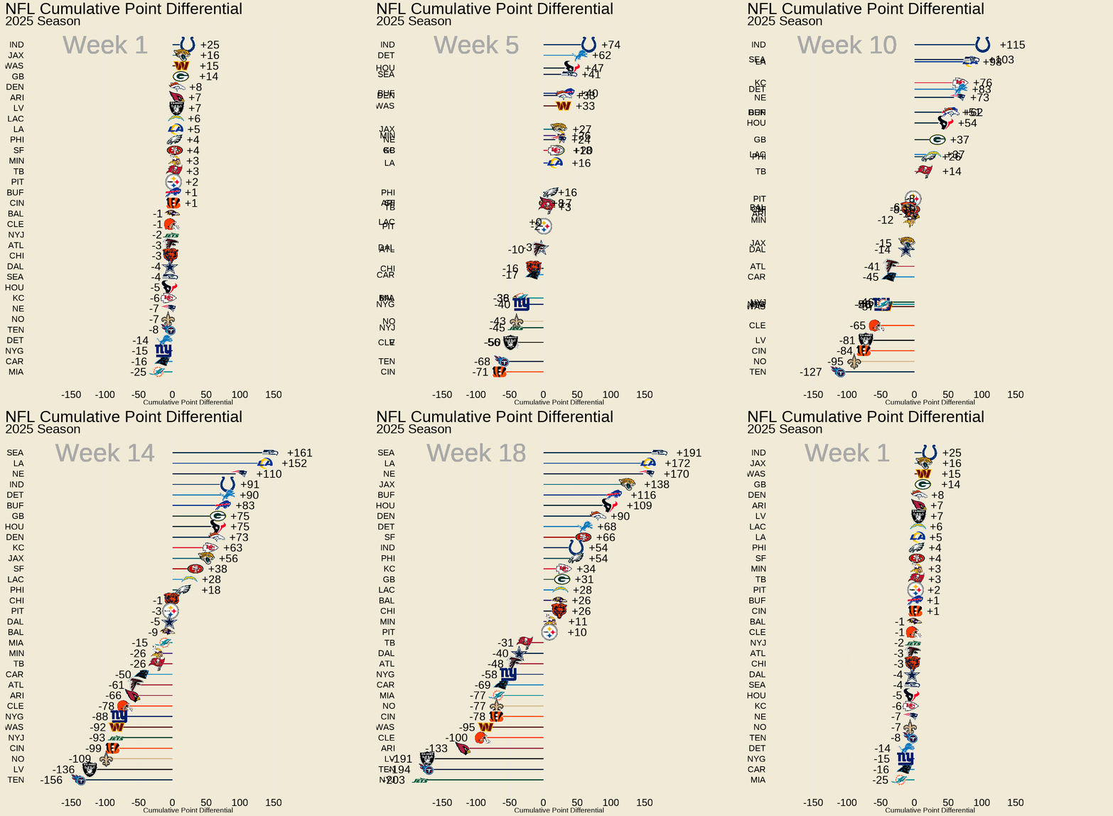
Welcome back! For a quick lesson on animating graphics we’re turning to NFL data and the gganimate package. It all started last week when I was wondering how many points the Bills had given up this year. This thought kicked around in my head for a while, and I landed on wondering what their cumulative point differential is through 13 weeks (now 14). Then, I said, why not do this for all the teams. A bar chart – or a series of them – would visualize this, but it’s a lot of charts to look through. Thankfully, gganimate exists to allow us to put these weekly charts into a single animation.
Learning objectives
This post’s learning objective is to:
make a static bar chart showing the cumulative point differential for all NFL teams through the current week, and
animate it to show every week of the season cumulatively
Libraries
As always, let’s make sure that our libraries are loaded and if any need to be installed that you run install.packages() line first.
All the data is nicely packaged for us in the nflfastR and nflreadr packages. Combine these with the tidyverse, ggimage, magick, showtext, and gganimate packages and we’re all set to play ball.
Data wrangling
The first step is to load the data and filter for only the 2025 season. Then, to replace any missing scores with 0s.
nfl_data <- nflreadr::load_schedules(seasons = 2025)

#|>
 # mutate(home_score = replace_na(home_score, 0),
  #       away_score = replace_na(away_score, 0))

#showing only the first five columns
glimpse(nfl_data[,1:5])
Rows: 285
Columns: 5
$ game_id <chr> "2025_01_DAL_PHI", "2025_01_KC_LAC", "2025_01_TB_ATL", "2025…
$ season <int> 2025, 2025, 2025, 2025, 2025, 2025, 2025, 2025, 2025, 2025, …
$ game_type <chr> "REG", "REG", "REG", "REG", "REG", "REG", "REG", "REG", "REG…
$ week <int> 1, 1, 1, 1, 1, 1, 1, 1, 1, 1, 1, 1, 1, 1, 1, 1, 2, 2, 2, 2, …
$ gameday <chr> "2025-09-04", "2025-09-05", "2025-09-07", "2025-09-07", "202…Then, we’ll wrangle a dataframe for the home score and one for the away score before combining them again.
These are the steps that we walk through to create the home_games and away_games dataframes.
- filter for only completed games
- select only columns of interest
- create a new team column
- create a new point difference column that subtracts away score from home score
- then select the columns needed
home_games <- nfl_data  |>
  filter(!is.na(result)) |>   # Only completed games
  select(week, home_team, home_score, away_score) |>
  mutate(
    team = home_team,
    point_diff = home_score - away_score
  ) |>
  select(week, team, point_diff)

away_games <- nfl_data  |>
  filter(!is.na(result)) |>   # Only completed games
  select(week, away_team, home_score, away_score) |>
  mutate(
    team = away_team,
    point_diff = away_score - home_score
  ) |>
  select(week, team, point_diff)
We now have half the teams with their weekly point differential in the home_games dataframe and half in the away_games dataframe. Now, join them by binding rows and naming the oupt team_point_diff.
team_point_diff <- bind_rows(home_games, away_games)  |>
  arrange(team, week)

glimpse(team_point_diff)
Rows: 570
Columns: 3
$ week <int> 1, 2, 3, 4, 5, 6, 7, 9, 10, 11, 12, 13, 14, 15, 16, 17, 18,…
$ team <chr> "ARI", "ARI", "ARI", "ARI", "ARI", "ARI", "ARI", "ARI", "AR…
$ point_diff <int> 7, 5, -1, -3, -1, -4, -4, 10, -22, -19, -3, -3, -28, -20, -…Since we are creating a chart that expects values to exist for all possible teams for all possible weeks we have to figure out what to do with bye weeks. Each week needs have 32 rows - one for each team - or there will be holes appearing in the animation. So, our total rows will equal 32 * highest week in data set.
Vectors are really useful for this kind of manipulation. We create an all_teams vector that contains all possible unique values of teams. The all_weeks vector does the same for the number of weeks.
Then, it’s easy to combine these vectors in complete_weeks and do a left join by the common “team” and “week” columns in complete_weeks and team_point_diff.
#create the vectors
all_teams <- unique(team_point_diff$team)
all_weeks <- 1:max(team_point_diff$week)

#Make a single data frame with all teams and all weeks
complete_weeks <- expand.grid(team = all_teams,
                              week = all_weeks)


# merge the data with left_join
merge_team_point_diff <- left_join(complete_weeks,
                                   team_point_diff, by = c("team", "week"))
Now we have 704 rows in our data. Since we know teams have bye weeks, there is likely some missing data. Here’s a simple way to do that.
is.na() will return true or false for missing data. If missing, then true. True = 1 so summing this vector will give us the count of missing values.
sum(is.na(merge_team_point_diff$point_diff))[1] 134Now let’s plug those in with 0s since the point differential would not change on a week that a team did not play.
#replace NAs with 0s
merge_team_point_diff <- merge_team_point_diff |>
  mutate(point_diff = replace_na(point_diff,0))

#check for missing values
sum(is.na(merge_team_point_diff$point_diff))
[1] 0The last manipulation is to create three, related parts.
- Create a column that stores the cumulative total using the
cumsum()fuction - Create a rank variable that puts them in order from highest(1) to lowest(32)
- Break the ties so that multiple teams aren’t appearing on the same bar
team_cumulative <- merge_team_point_diff |>
  group_by(team) |>
  arrange(week) |>
  mutate(cum_pt_diff = cumsum(point_diff)) |>   ungroup() |>
  #rank the cumulative point differences for each week
  group_by(week) |>
  mutate(rank = min_rank(desc(cum_pt_diff))) |>
  ungroup() |>
  #sort point diff each week by rank and break ties
  group_by(week) |>
  arrange(rank) |>
  mutate(tie_break = seq(1,n())) |>
  ungroup()
Static chart
Now that we’ve manipulated our data we’re ready to make the static chart that will provide the template for our animated chart.
We’ll create a vector for the latest week that we use for chart labels. This will update whenever we rerun our script after a weekend of football.
latest_week <- max(team_cumulative$week)

current_standings <- team_cumulative %>%
  filter(week == latest_week)


p <- ggplot(current_standings, aes(x = cum_pt_diff,
                                   y = reorder(team, cum_pt_diff))) +
  geom_col(show.legend = FALSE) +
  geom_text(aes(label = sprintf("%+d", cum_pt_diff),
                hjust = ifelse(cum_pt_diff >= -20 & cum_pt_diff <0, 3.5,
                               ifelse(cum_pt_diff > 0 & cum_pt_diff <= 20, -2,
                                      ifelse(cum_pt_diff > 20, -1,2.2))),
            ),
            size = 2)+
  scale_x_continuous(expand = expansion(mult = c(0.1, 0.15)),
                     limits = c(-175, 175),
                     breaks = c( -150, -100, -50, 0,
                                50, 100, 150)) +
  labs(
    title = "NFL Cumulative Point Differential",
    subtitle = paste0("2025 Season: Week ", current_standings$week),
    x = "Point Differential",
    y = NULL
  ) +
  theme_minimal(base_size = 18) +
  theme(
    plot.title = element_text(size = 18, face = "bold", family = "Times"),
    plot.subtitle = element_text(size = 14, family = "Times"),
    axis.text.y = element_text(size = 8, family = "Times", face = "bold"),
    axis.text.x = element_text(size = 8, family = "Times", face = "bold"),
    axis.title.x = element_text(size = 10, family = "Times", face = "bold"),
    panel.grid.major.y = element_blank(),
    legend.position = "none",
    panel.grid.minor = element_blank(),
    plot.background = element_rect(fill = "#F0EAD6")
  )

p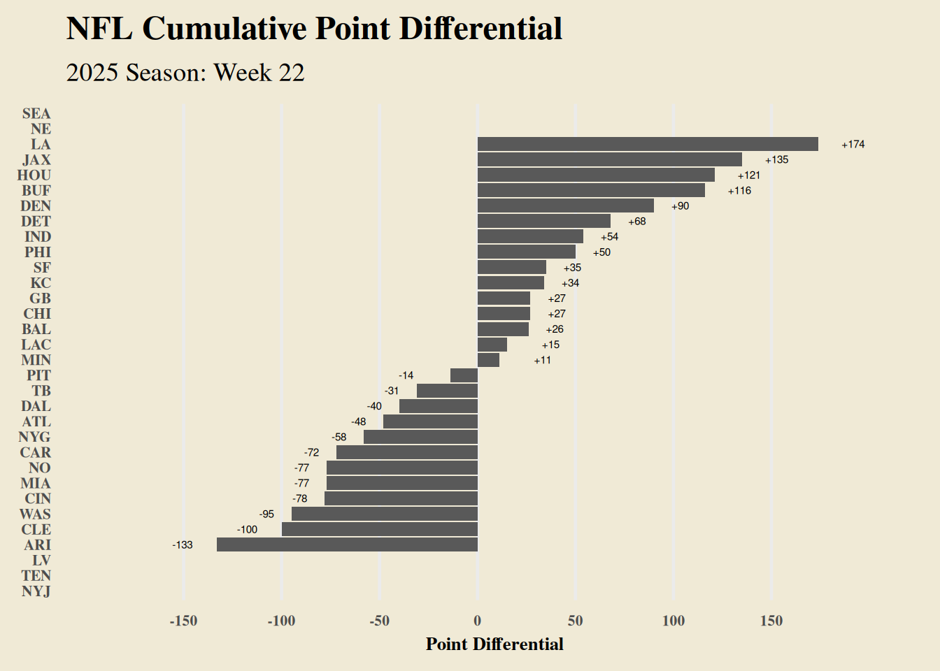
There we have our cumulative point leaders at week 22. This is really plain though. Let’s add team colors, logos, and shrink the size of the bar.
Logos and such
The logos are already available in the nflreadr package so it’s simply a matter of creating an storing them for our use.
We’ll create a folder for them and use the walk2() from the purrr package in combination with some graphics handling from the magick package to write the variables for the logo and the team abbreviation to the folder.
We’ll also join the logos to the overall dataframe so we can access them directly in as an aesthetic.
# Create logos folder only if it doesn't exist
if (!dir.exists(here::here("logos"))) {
  dir.create(here::here("logos"))
}

teams_data <- nflreadr::load_teams()

#Use walk2 for 2 variables and write them to the correct path.
walk2(
  teams_data$team_abbr,
  teams_data$team_logo_espn,
  ~ image_write(
    image_read(.y),
    path = here::here("posts/nfl_racing_chart/logos/", paste0(.x, ".png"))
  )
)

#join the team logos to the dataframe
team_cumulative <- team_cumulative %>%
  left_join(teams_data %>% select(team_abbr, team_logo_espn),
            by = c("team" = "team_abbr"))
And we can create a vector for the team colors in a new plot fuction that incorporates the team logos and colors.
latest_week <- max(team_cumulative$week)
current_standings <- team_cumulative %>%
  filter(week == latest_week)

#vector with team colors
team_colors <- setNames(teams_data$team_color, teams_data$team_abbr)

p <- ggplot(current_standings, aes(x = cum_pt_diff,
                                   y = reorder(team, cum_pt_diff),
                                   fill = team)) +
  geom_col(show.legend = FALSE,
           width = .1) +
  geom_point(aes(x = cum_pt_diff,
                 y = reorder(team, cum_pt_diff)),
             color = "#F0EAD6",
             size = 5.3)+
  geom_image(aes(image = team_logo_espn, x = cum_pt_diff),
             hjust = .9,
             size = 0.05) +
  geom_text(aes(label = sprintf("%+d", cum_pt_diff),
                hjust = ifelse(cum_pt_diff >= -20 & cum_pt_diff <0, 3.5,
                               ifelse(cum_pt_diff > 0 & cum_pt_diff <= 20, -2,
                                      ifelse(cum_pt_diff > 20, -1,2.2))),
            ),
            size = 10)+
  scale_x_continuous(expand = expansion(mult = c(0.1, 0.15)),
                     limits = c(-175, 175),
                     breaks = c( -150, -100, -50, 0,
                                50, 100, 150)) +
  scale_fill_manual(values = team_colors) +
  labs(
    title = "NFL Cumulative Point Differential",
    subtitle = paste0("2025-26 Season: Week ", current_standings$week),
    x = "Point Differential",
    y = NULL
  ) +
  theme_minimal(base_size = 18) +
  theme(
    plot.title = element_text(size = 48, face = "bold", family = "Times"),
    plot.subtitle = element_text(size = 40, family = "Times"),
    axis.text.y = element_text(size = 30, family = "Times", face = "bold"),
    axis.text.x = element_text(size = 30, family = "Times", face = "bold"),
    axis.title.x = element_text(size = 36, family = "Times", face = "bold"),
    panel.grid.major.y = element_blank(),
    legend.position = "none",
    panel.grid.minor = element_blank(),
    plot.background = element_rect(fill = "#F0EAD6")
  )

ggsave(here::here("output/nfl_point_diff_current.png"),
       plot = p,
       width = 6,
       height = 8,
       units = "in",
       dpi = 300)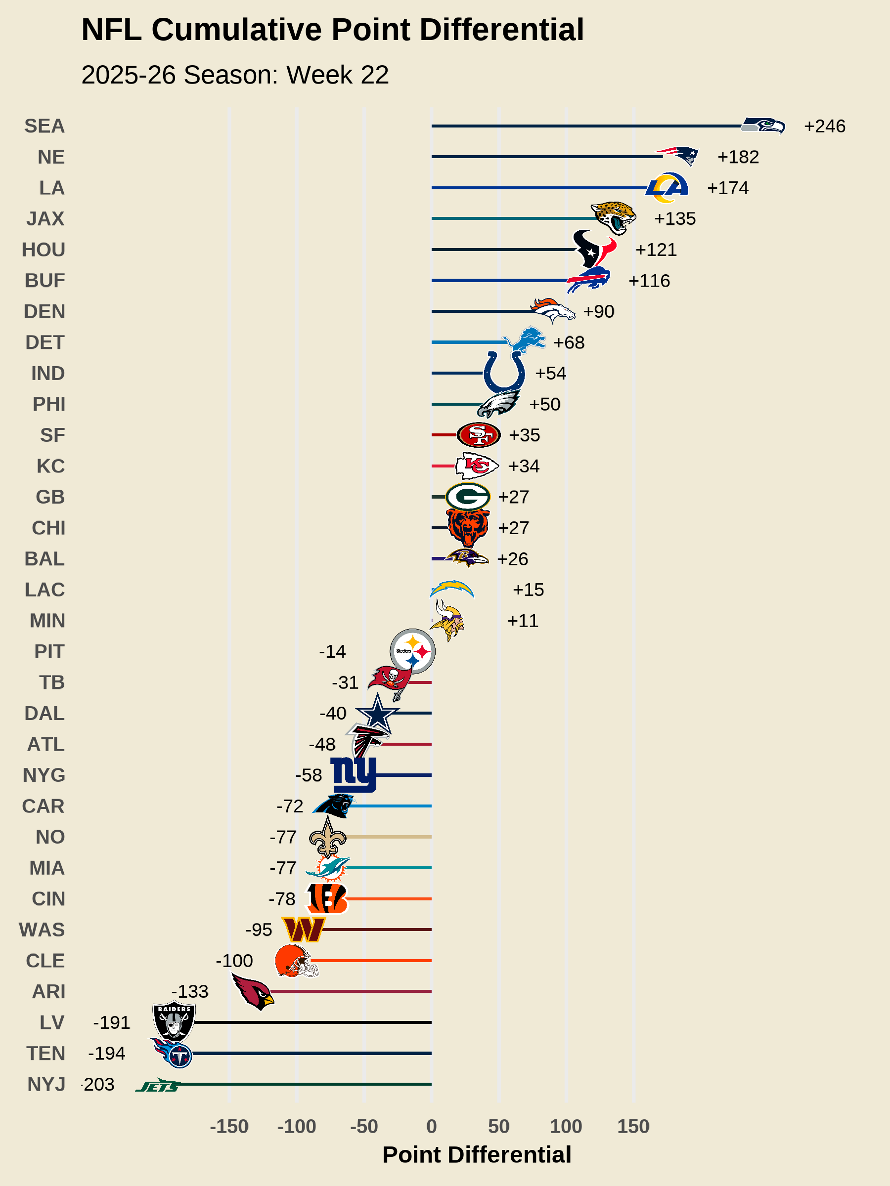
From Static to Animated
Now that we have a polished static chart, let’s transform it into an animation that shows how teams’ cumulative point differentials evolved week by week. The transition from ggplot to gganimate requires a few strategic changes, but the core structure remains the same.
The Big Picture
The animated version uses the full team_cumulative dataset instead of filtering to just the latest week. This gives gganimate all the weekly data it needs to create the racing bar chart effect. Beyond that, there are four key changes we need to make:
Swap the Y-Axis from Team Names to Tie-Breaker
In the static chart, we used reorder(team, cum_pt_diff) on the y-axis to sort teams by their point differential. For animation, we need something more dynamic.
aes(x = cum_pt_diff, y = -tie_break, group = team)The tie_break variable we created during data wrangling assigns each team a unique position from 1 - 32 for every week based on their rank. Using -tie_break flips the order so the teams with the highest positive differential appear on top. The group=team aesthetic is crucial–it tells gganimate to track each team across weeks.
Add Team Labels as Text
We no longer have the team abbreviations along the y-axis. Instead, they are added as labels on the chart to the left side.
geom_text(aes(label = team), x = -200,
            hjust = 1.1,
            size =6,
            color = "black",
            family = "Times")
Add a Week Counter
This helps track the week as it changes. We add a large, semi-transparent week label so the eyes don’t have to jump back and forth from a subtitle to the chart.
geom_text(x = -100, y = -1,
            family = "Times",
            aes(label = sprintf("Week %d", week)),
            size = 18,
            color = "darkgrey")
Remove Text from the Y-axis
What used to the be on the Y-axis is now in a geom_text so any y-axis text is meaningless. We simply remove them.
theme(
  axis.text.y = element_blank(),
  # ... other theme elements
)
Bringing It to Life
The magic happens at the end with just one additional function:
gganimate::transition_states(week,
                            transition_length = 20,
                            state_length = 40)
This tells gganimate to:
- Create a separate state for each week
- Spend 20 frames transitioning between weeks (smooth movement)
- Hold each week’s state for 40 frames (pause to view)
Finally, the animate() function renders everything and saves it to the folder of your choice:
animate(anim,
        nframes = 300,   # total frames in the animation
        fps = 10,        # frames per second
        width = 1000,
        height = 1100,
        renderer = gifski_renderer(here::here("posts/nfl_racing_chart/nfl_point_diff_race.gif")))
With 14 weeks of data, transition_length = 20 and state_length = 40 means each week gets 60 frames total (20 for movement and 40 for pause). The 300 total frames gives us a smooth transition with 10 frames per second playback speed.
Minor Adjustments
You’ll notice a few other small tweaks in the code for the animated version:
Adjusted the
hjustvalues ingeom_text()to account for the changing bar lengths and logosModified
scale_x_continuous()to accommodate team labels on the leftRemoved the y-axis text and adjusted theme elements accordingly
Pro-tip! Start with a low number of frames so that you can iteratively test out different aesthetics without waiting 20 minutes for rendering. Start by setting
nframes = 50(or 100) in sideanimate().
The beauty of this approach is that once you have a solid static ggplot, converting it to an animation is mostly about swapping a few aesthetics and adding the transition layer. The rest of your carefully crafted styling—colors, logos, text positioning, etc.—carries over seamlessly.
anim <- team_cumulative  |>
  ggplot(aes(x = cum_pt_diff, y = -tie_break,
             fill = team, group = team)) +
  geom_col(show.legend = FALSE,
           orientation = "y",
           width = .1) +
  geom_point(aes(x = cum_pt_diff,
                 y = -tie_break,
                 group = team,
                 size = ifelse(team=="IND"| team=="NYJ",
                               15, 8)),
             color = "#F0EAD6")+
  scale_size_identity()+
  geom_image(aes(image = team_logo_espn, x = cum_pt_diff),
             hjust = .9,
             size = 0.05) +
  geom_text(aes(label = team), x = -200,
            hjust = 1.1,
            size =6,
            color = "black",
            family = "Times")+
  geom_text(aes(label = sprintf("%+d", cum_pt_diff),
                hjust = ifelse(cum_pt_diff >= -20 & cum_pt_diff <0, 2,
                               ifelse(cum_pt_diff > 0 & cum_pt_diff <= 20, -1,
                                      ifelse(cum_pt_diff > 20, -0.7, #2,
                                             ifelse(cum_pt_diff > 140, .7, 1.7))))),
    size = 8,
    family = "Times")+
geom_text(x = -100, y = -1,
            family = "Times",
            aes(label = sprintf("Week %d", week)),
            size = 18,
            color = "darkgrey") +
  scale_x_continuous(limits = c(-210, 200),
                     breaks = c(-150, -100, -50, 0,
                                50, 100, 150)) +
  scale_fill_manual(values = team_colors)+
  scale_color_identity()+
  labs(
    title = "NFL Cumulative Point Differential",
    subtitle = "2025 Season",
    x = "Cumulative Point Differential",
    y = NULL
  ) +
  theme_minimal(base_size = 14) +
  theme(
    plot.title = element_text(size = 32,
                              face = "bold",
                              color = "black",
                              family = "Times"),
    plot.subtitle = element_text(size = 26,
                                 color = "black",
                                 family = "Times"),
    axis.text.y = element_blank(),
    axis.text.x = element_text(color = "black",
                               family = "Times",
                               size = 20),
    panel.grid.major.y = element_blank(),
    panel.grid.minor = element_blank(),
    plot.background = element_rect(fill = "#F0EAD6"),
    legend.position = "none"
  ) +
  gganimate::transition_states(week,
                             transition_length = 20,
                             state_length = 40
                             )


animate(anim,
        nframes = 300,
        fps = 10,
        width = 1000,
        height = 1100,
        renderer = gifski_renderer(here::here("posts/nfl_racing_chart/nfl_point_diff_race.gif")))